How to Write a Cover Letter (Even With No Tech Experience)
TL;DR: Even with no experience, your cover letter can show that you’re still worth an interview. A good cover letter...
Read MoreTake our 3-minute quiz to figure out if a tech career is right for you.


TL;DR: Even with no experience, your cover letter can show that you’re still worth an interview. A good cover letter...
Read More
TL;DR: Your LinkedIn summary acts like the friend who hypes you up to everyone. In a few lines, say what...
Read More
TL;DR: Think your resume is ready to send to your dream employer? It might need a few tweaks. We’re covering...
Read More
TL;DR: AI agents are programs that can think, plan, and take action all by themselves. It’s not like traditional AI...
Read More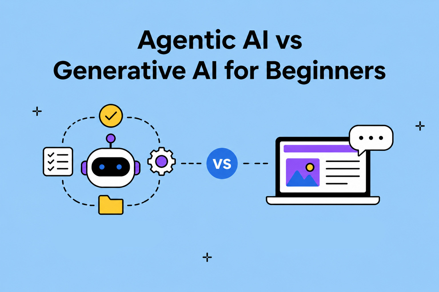
TL;DR: Generative AI is your creative friend that likes to write and make images. Agentic AI is your type-A friend...
Read More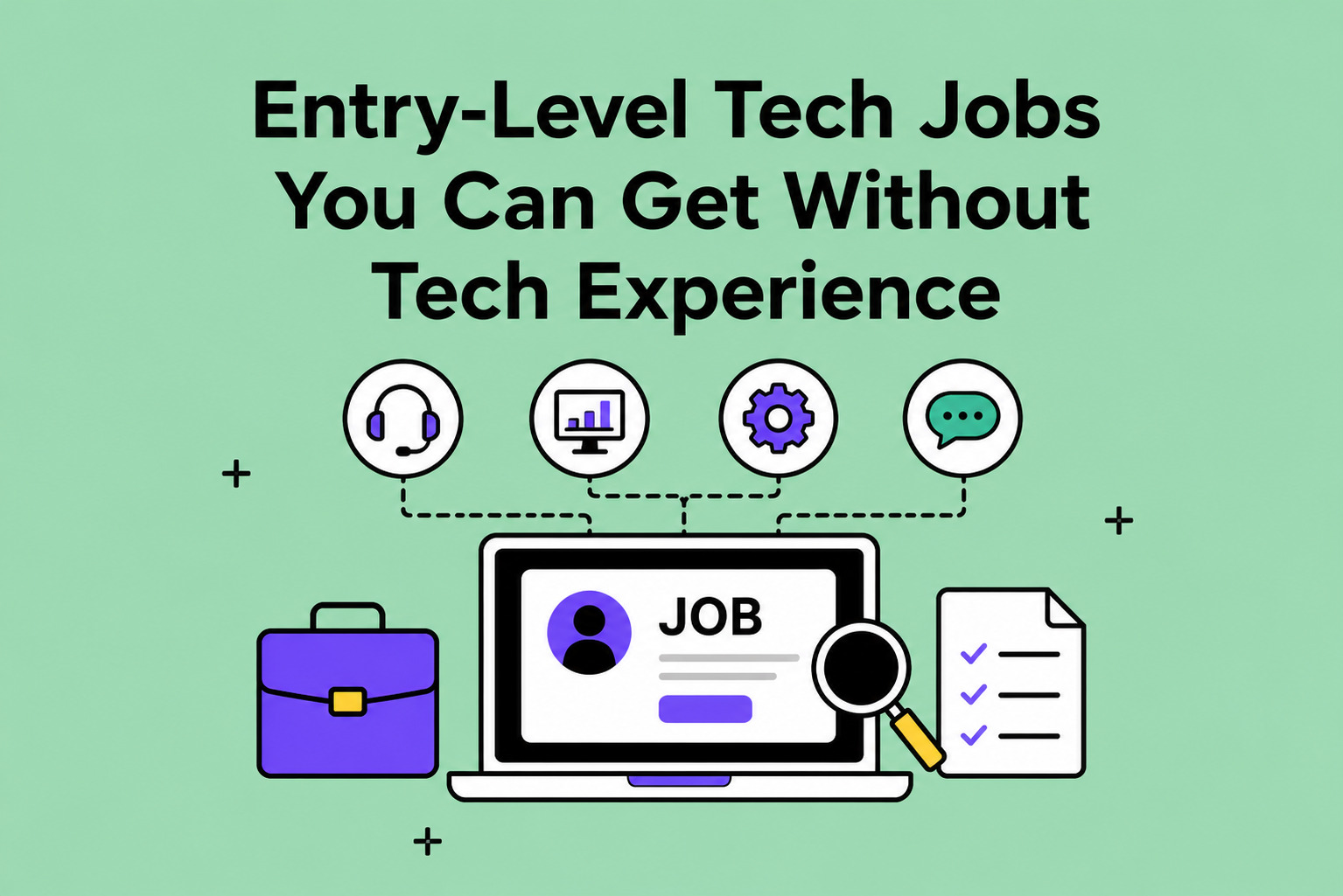
TL;DR: You don’t need a tech background to break into tech. There are many roles that don’t require a fancy...
Read More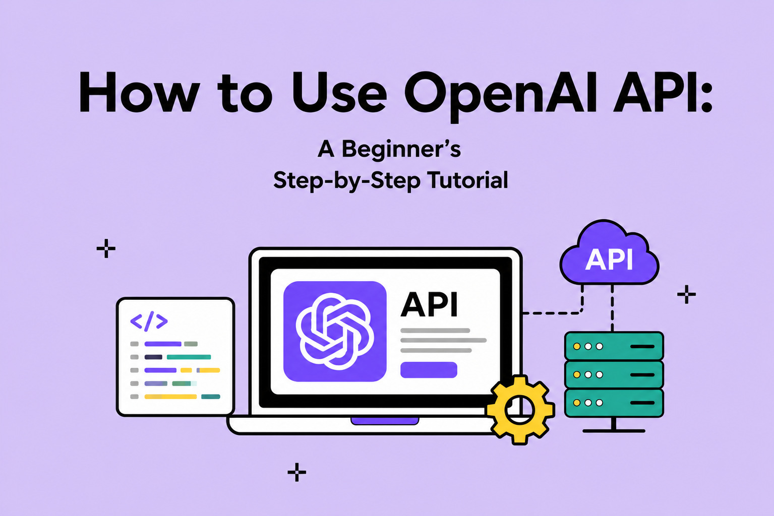
TL;DR: Imagine plugging the power of ChatGPT into your own projects. That’s what OpenAI API lets you do. From chatbots...
Read More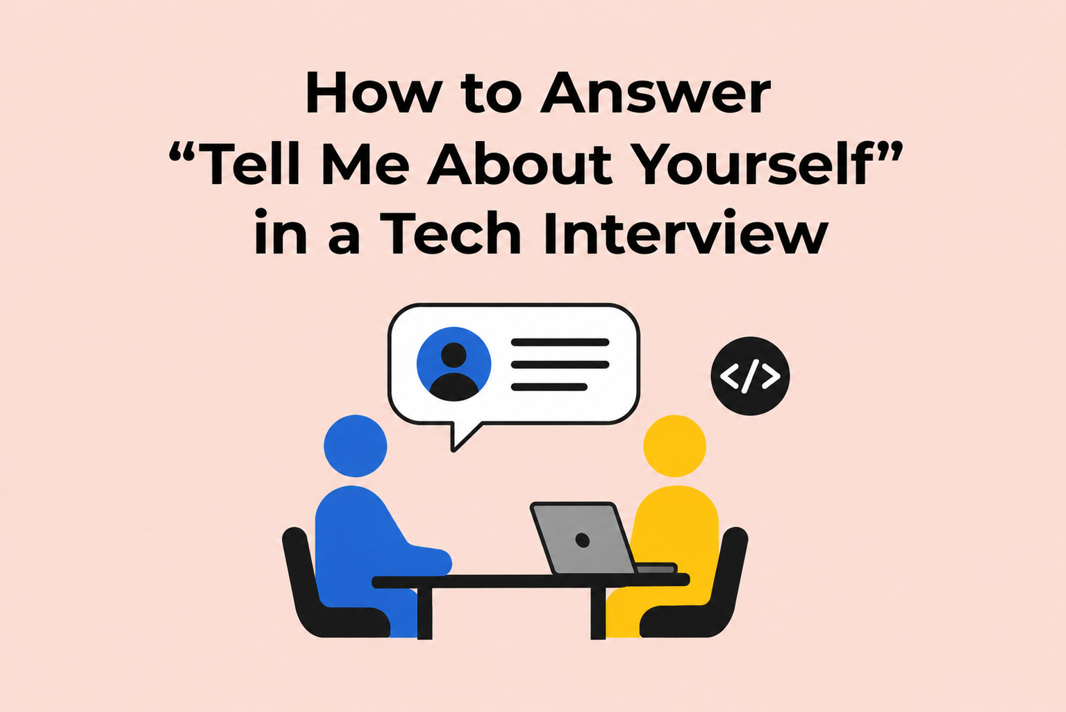
TL;DR: Out of every question in your tech interview, this one gives you the most control over your story. Once...
Read More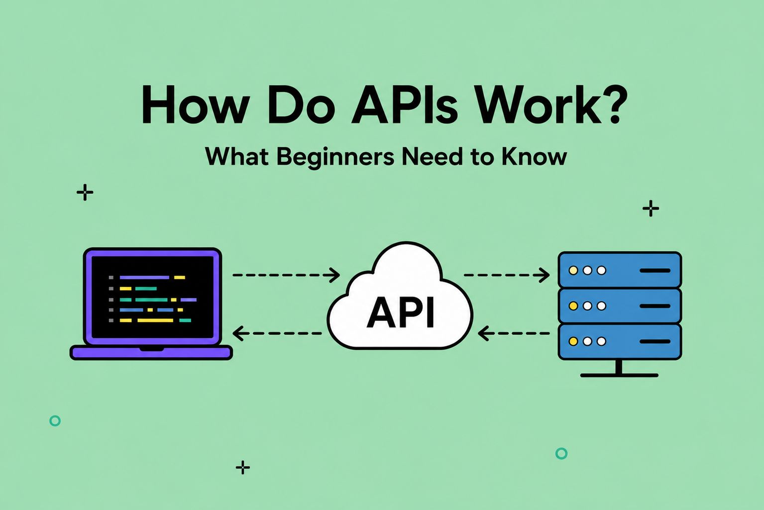
TL;DR: An API is like a mutual friend who introduces two people and helps them talk to each other. Except...
Read More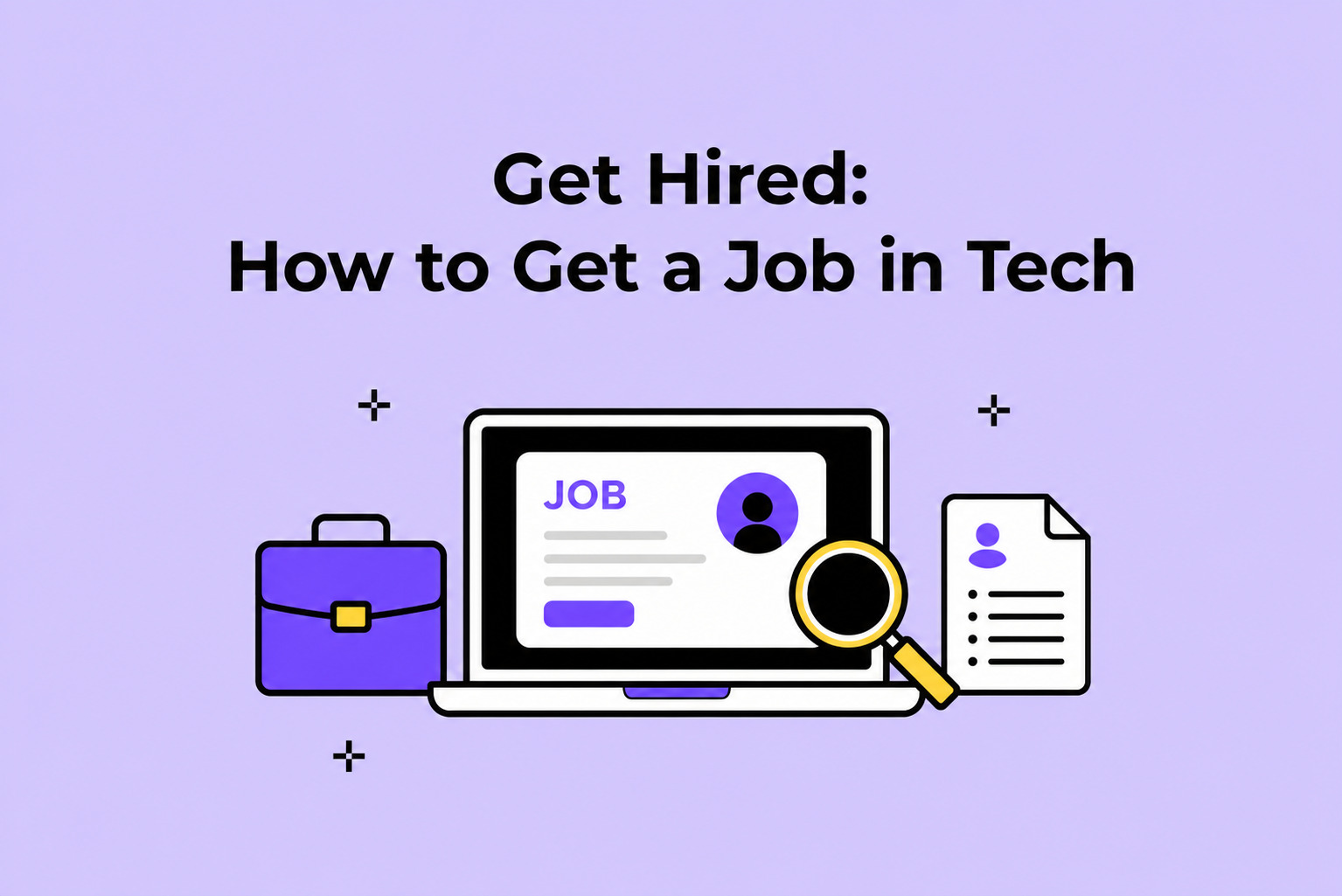
TL;DR: Ready to get hired? This job search guide breaks down how to get a tech role. We’ll fix your...
Read More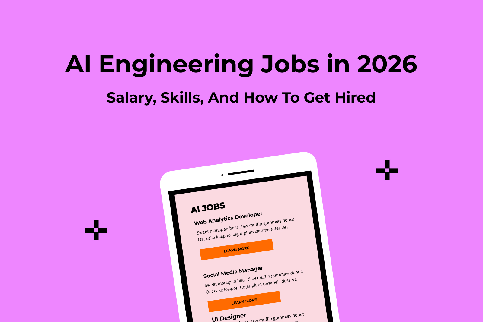
TL;DR: AI engineering is THE fastest growing tech career right now – everyone’s talking about it, and for good reason....
Read More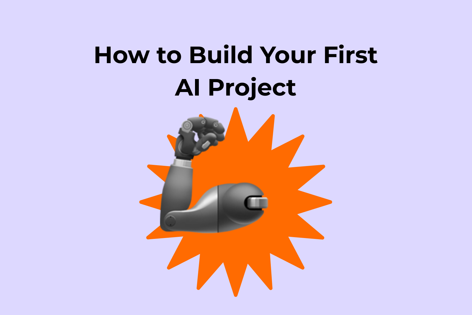
TL;DR: Here’s your backstage pass to building your first AI project. You’ll explore 5 fun, beginner-friendly ideas, and we’ll show...
Read More