Landing Page Design: How to Create Pages That Convert (With Examples)
Whether you’re running email campaigns, Google Ads, or a social media ad, your main goal is to pique your target audience’s interest and get them to click. But a click doesn’t equal a conversion. To show interested prospects what you have to offer, you’ll need an effective landing page design.

Website design is a powerful tool for nurturing leads and improving your conversion rate. While a website’s home page is primarily designed to introduce a company and its products or services, a landing page is created with a single focus in mind: conversion.
What Is a Landing Page, Exactly?
A landing page is similar to a website—it’s a web page with its own URL that visitors can land on. But while a website’s goal is to provide general information and drive visitors to explore the rest of the site, a landing page has one purpose only: to convert visitors into leads or customers.
For example, if you’re running an email campaign promoting a new e-book, you would send your subscribers to a landing page with a form where they can enter their information in exchange for the e-book.
Or, if you’re running a Google Ads campaign selling T-shirts, you would send your clicks to a landing page with product photos, descriptions, and the ability to purchase the shirt.
While a website is designed to provide a broad overview of what a company does, landing page design is laser-focused on one clear benefit. And that’s why it’s important to optimize your website design to convert—it determines the success of your marketing campaigns.
A landing page can take many forms:
- A scrollable sales page that walks visitors through a specific use case for your product
- A lead generation form that captures information in exchange for an offer
- A click-through page that entices visitors to explore more of your website
- A product page that prompts a user to make a purchase
The kind of website design you create will depend on your goals. But no matter what type of page you’re creating, there are certain visual elements that effective website design shares.
How to Design the Perfect Landing Page
There are a few ways to create a professional-looking landing page design. The good news is that you don’t need coding experience or a degree in web design to create one.
- Website Design Templates: Web design templates give designers an easy way to create a landing page pre-designed basics. All you need to do is add your own text, images, and branding.
- Free Landing Page Builders: A free website builder like Webflow or Carrd helps web designers create SEO-friendly web design with a drag-and-drop interface.
- Paid Website Builders: A paid landing page builder like Shopify or Unbounce offers more features and design flexibility than a free builder. Plus, you’ll get access to professional landing page templates that are designed to convert.
- Custom Web Design: Using tools like Figma, you can control the typographic details, white space, and overall composition of your landing pages.
- Coding: If you’re comfortable with design basics, you can build a landing page by coding it yourself or working with a web developer. This option gives you complete control over the functionality of your UX and web design.
Landing Page Examples
Let’s take a look at some landing page examples and see why each landing page works.
1. Verkada: Scrollable Product Page
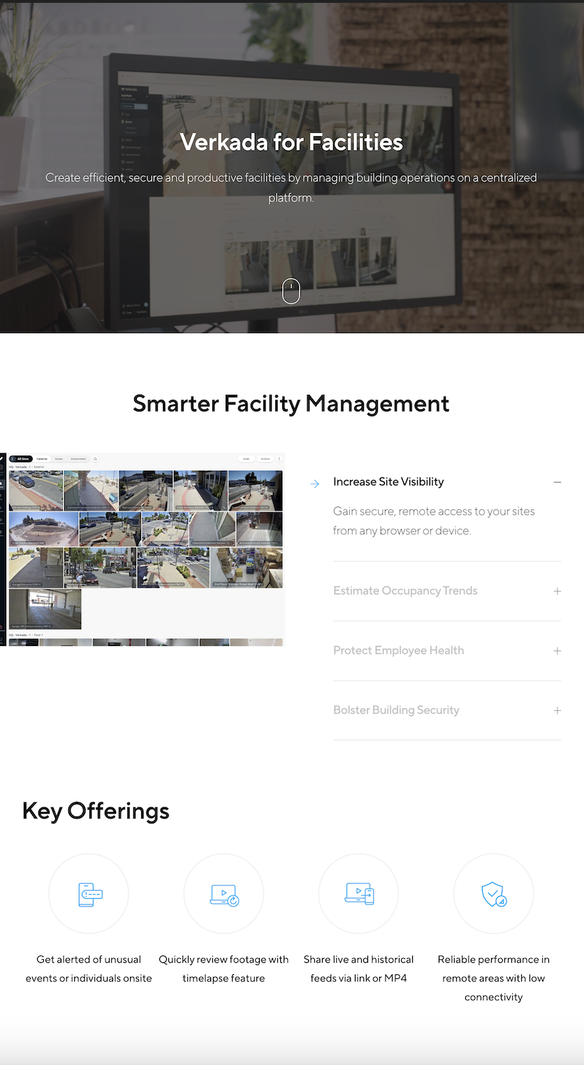
Verkada is a security camera company that sells to businesses. Their primary focus is on enterprise companies, so their design reflects that.
This page is effective because it’s focused on a specific use case and does a great job of walking the user through all the product features. In this instance, it demonstrates how Verkada systems can be used for facility monitoring and management.
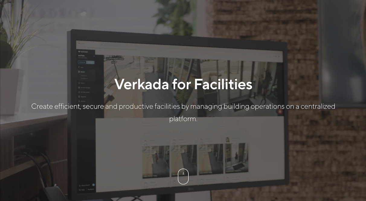
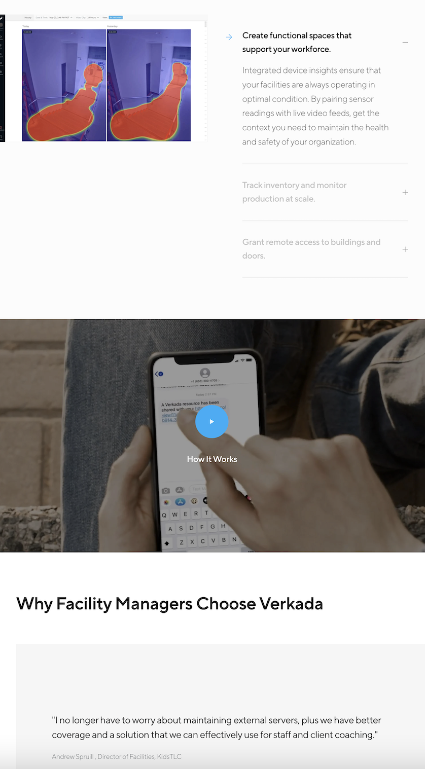
Behind the landing page headline and sub-headline, a looping video montage shows the product in action. As the user scrolls, there’s a chronological list of features with accompanying images and descriptions.
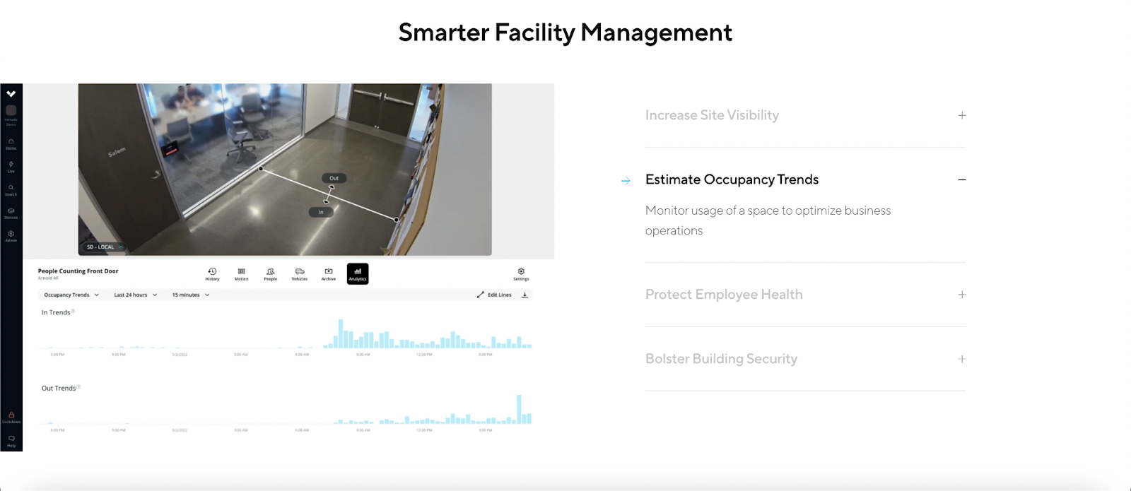
Each feature is not readily displayed, either. The user can click through each one to learn more.
In Verkada’s web design, ample white space keeps the text from feeling overwhelming, and the use of video and images breaks up the text.
Responsive design allows users to learn about the products at their own rate. For such a robust product, minimalism is key to getting viewers to comprehend everything on the page.
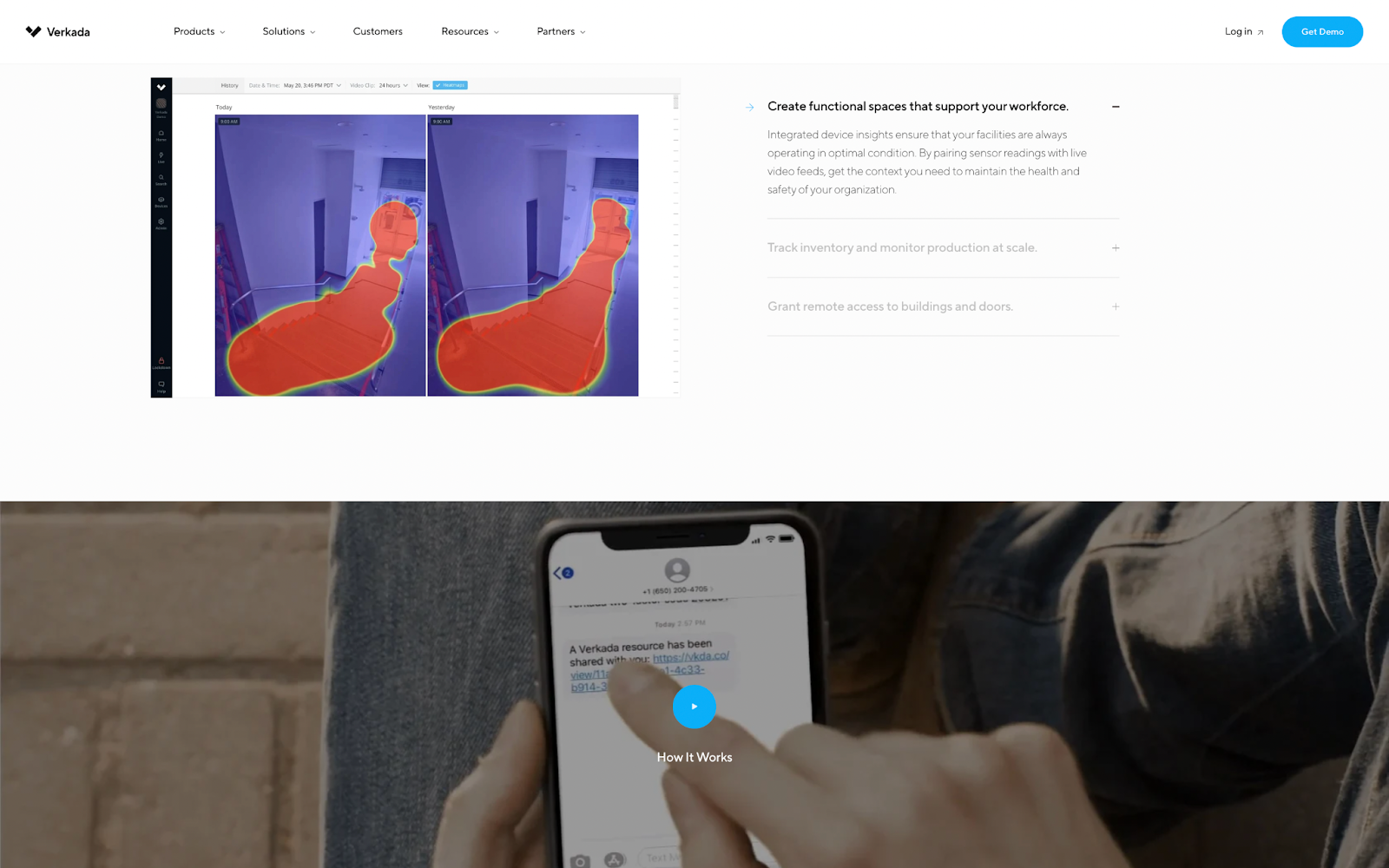
What’s also interesting about this web page design is that it’s made to look like a product demo, which builds urgency for website visitors. By giving them a taste of what the product does, Verkada encourages visitors to take action and learn more about its security system.
What Verkada teaches us:
Dynamic videos and images can showcase your product. There’s more to graphic design then using stock photos and landing page templates. By showing your product in action, you can give viewers a sense of how it works and what it can do for them.
Use chronology to tell a story. A great landing page walks users through a specific use case in a way that makes sense. Verkada starts with product overview, then dives into each feature in a responsive way.
White space simplifies the complex. When presenting a lot of information, white space can break it up and help users see a hierarchy.
2. Neil Patel: Lead Generation Form
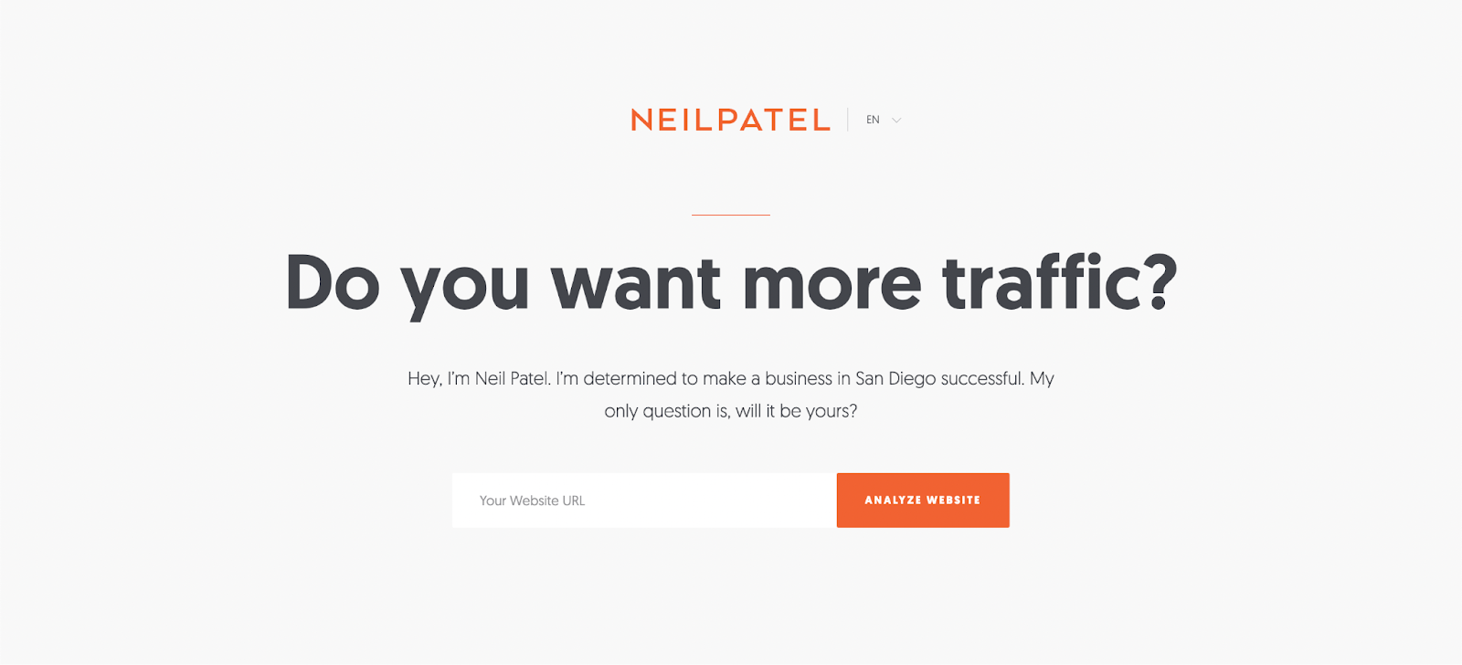
Neil Patel is a world-class marketer and the founder of several successful companies, including Crazy Egg, KISSmetrics, and Hello Bar. He’s also an in-demand speaker, consultant, and educator.
This lead magnet for his blog (NeilPatel.com) is remarkably basic—it consists of a few words, an email box, and a CTA button. And yet, it’s one of the most effective lead generation pages on the internet.
When users visit Neil Patel’s blog, they may be interested in reading his latest articles. But with this landing page, they’re also given the opportunity to learn more about their own website and how they can enhance it.
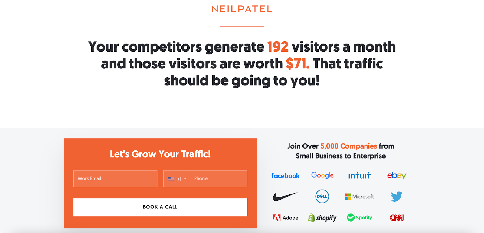
Post-click, users are invited to exchange their email addresses and book a call. In exchange for their time, Neil promises a free website analysis.
This benefit-oriented CTA is irresistible because it’s something that would normally cost hundreds of dollars.
One of the key differences that makes Neil Patel’s website design conversion-optimized is his messaging—it is personalized and on-brand. His website accounts for the user’s location and each highlighted element matches the orange and white color palette.
What Neil Patel teaches us:
Design basics work. For a lead generation landing page the basics will do. At the foundational level, all it needs is a headline, a form, and CTA buttons.
Highlight your value proposition. Whether it’s a free trial, cost savings, or added value that would normally cost money, web designers can improve the chances of an opt-in by bringing the offer front and center.
Personalize your page. You can take design basics to the next level by creating a web design that speaks to your customers.
3. Zillow: Click-Through Page
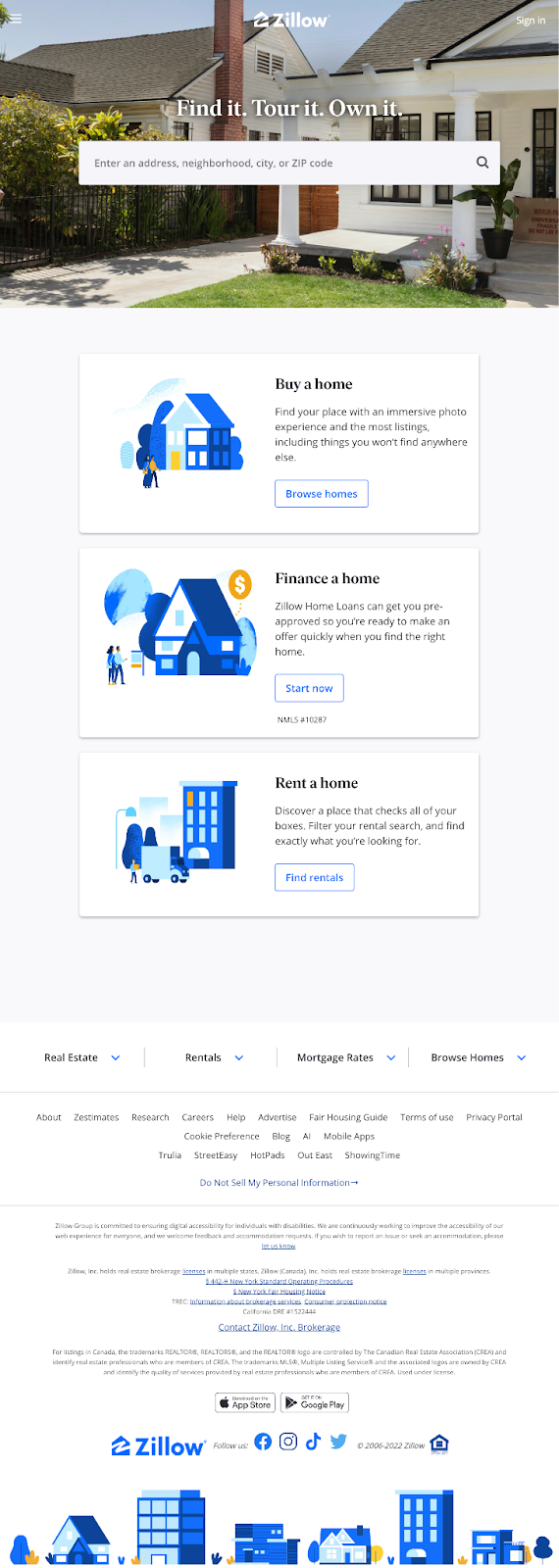
Zillow is one of the most popular real estate websites, and its platform reflects that. When visitors find themselves on Zillow’s main landing page, they don’t see long-form content that explains the company’s service.
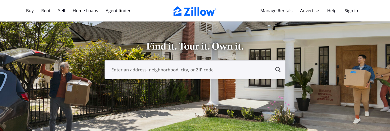
Instead, they see one basic CTA inside a search box: “Enter an address, neighborhood, city, or ZIP code.”
This is a click-through page—its sole purpose is to get visitors to respond to the CTA and move through the conversion funnel. And in Zillow’s case, that next page is a search results page where users can find homes for sale or rent in their desired location.

Below the search bar, there are three other options that users can click on: “Buy a home,” “Finance a home,” or “Rent a home.”
Each CTA button takes visitors to a relevant web page. For example, clicking on “Buy a home” will take users to a search results page where they can only see homes that are for sale.
What Zillow teaches us:
Click-through landing pages don’t need a complex website design. All they need is a CTA button and a way to segment your potential customers.
Put the product in the user’s hands. This landing page design works because its search feature puts the power in the user’s hands. They can decide what they want to see and where they want to go next.
Make your design action-oriented. Zillow’s navigation bar is prominently displayed and easy to use. And its CTA buttons are clear and concise. There’s no confusion about what will happen when you click the CTA.
4. BOOM: Online Store
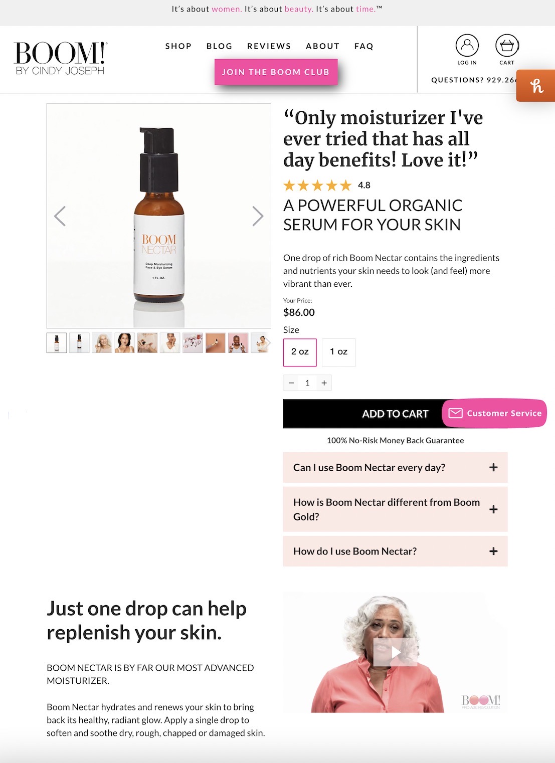
BOOM by Cindy Joseph is a store that sells health and wellness products. The landing page design for the brand’s organic face and eye moisturizer is among their highest converting.
Like most product pages, BOOM’s landing page design features a photo of the product on the left-hand side, clickable photos beneath it, a headline, some copy, and a CTA. But what makes this page effective is its use of social proof.
“Only moisturizer I’ve ever tried that has all-day benefits! Love it!” reads the testimonial in big, bold typeface. In some cases, social proof is hyperlinked or nestled below the fold. But in BOOM’s website design, the attention-grabbing testimonial sits right at the top of the page.
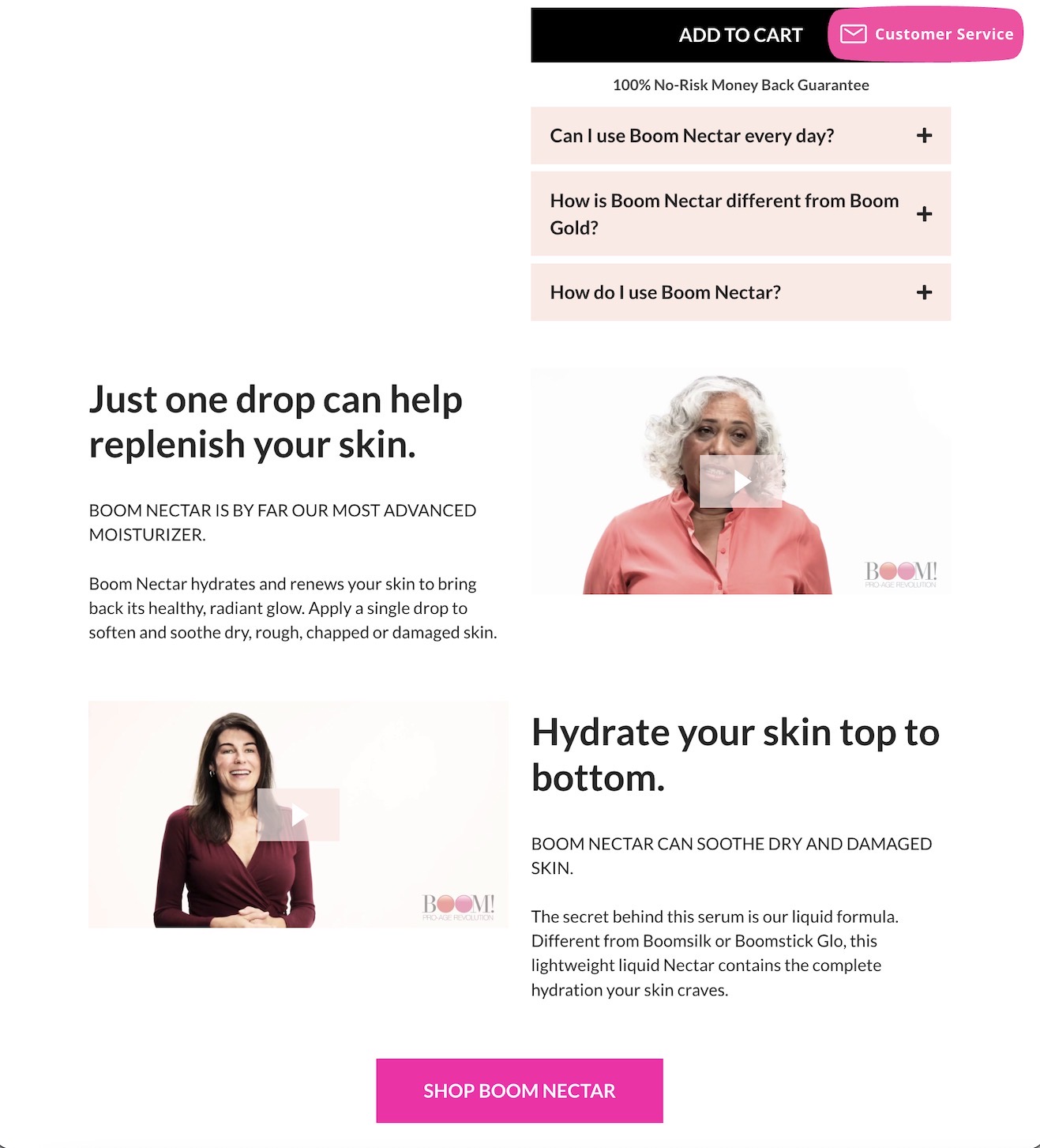
BOOM uses the space beneath the product box to display features in traditional landing page design format. Small feature-to-benefit copy snippets alternate sides with corresponding testimonials.
What BOOM teaches us:
Social proof sells. Highlight positive customer experiences prominently in your web design.
Use customer photos and videos. Photos of real people using your product add a level of authenticity that is rare in the e-commerce world.
Product features matter. And turning them into benefits will boost your conversion rate.
5. Wag!: Sign-Up Form
Wag! is a dog walking and pet caregiving app that allows dog owners to schedule walks, track their dog’s activity, and find caregivers while they are away.
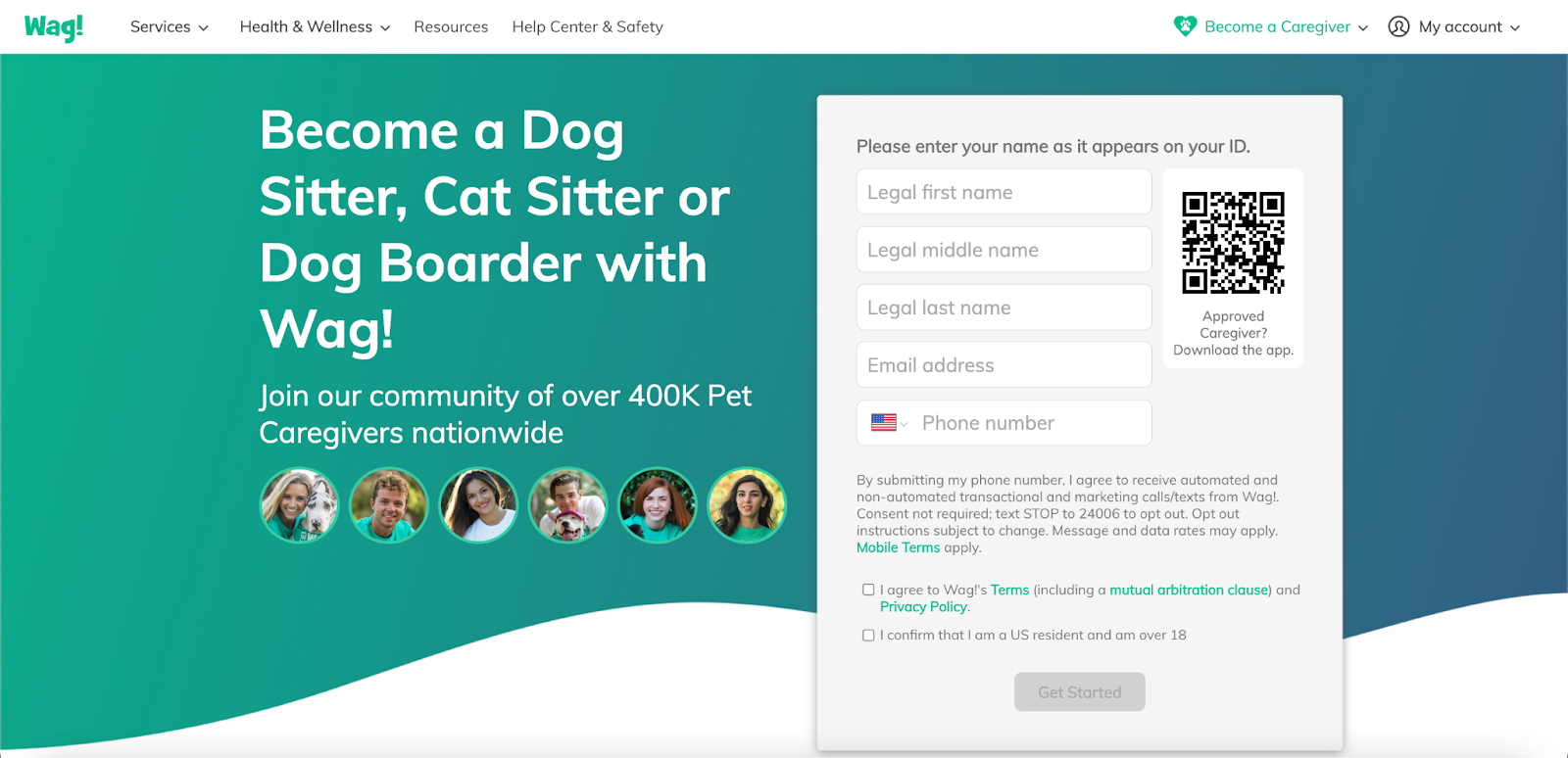
The company’s sign-up form design couldn’t be more straightforward. Enter your first, middle, and last name, your email address, and your phone number to begin.
The blue-green background color scheme is in direct contrast to the white form fields and text content, allowing it to pop on the screen.
And the QR code that sits in the upper right-hand corner is a nice touch. It allows potential caregivers to scan the code and download the app hands-free.
What Wag! teaches us:
Make signing up for your service easy. The easier the sign-up process, the greater your chance of exceeding your conversion goal.
Prioritize contrast. Balance between your form fields and text makes it easy to read for those who fill them out.
Make the user experience as convenient as possible. UX designers should include QR codes, buttons, and visual cues to make it easy for users to navigate the site.
6. ClickUp: Simple Product Page
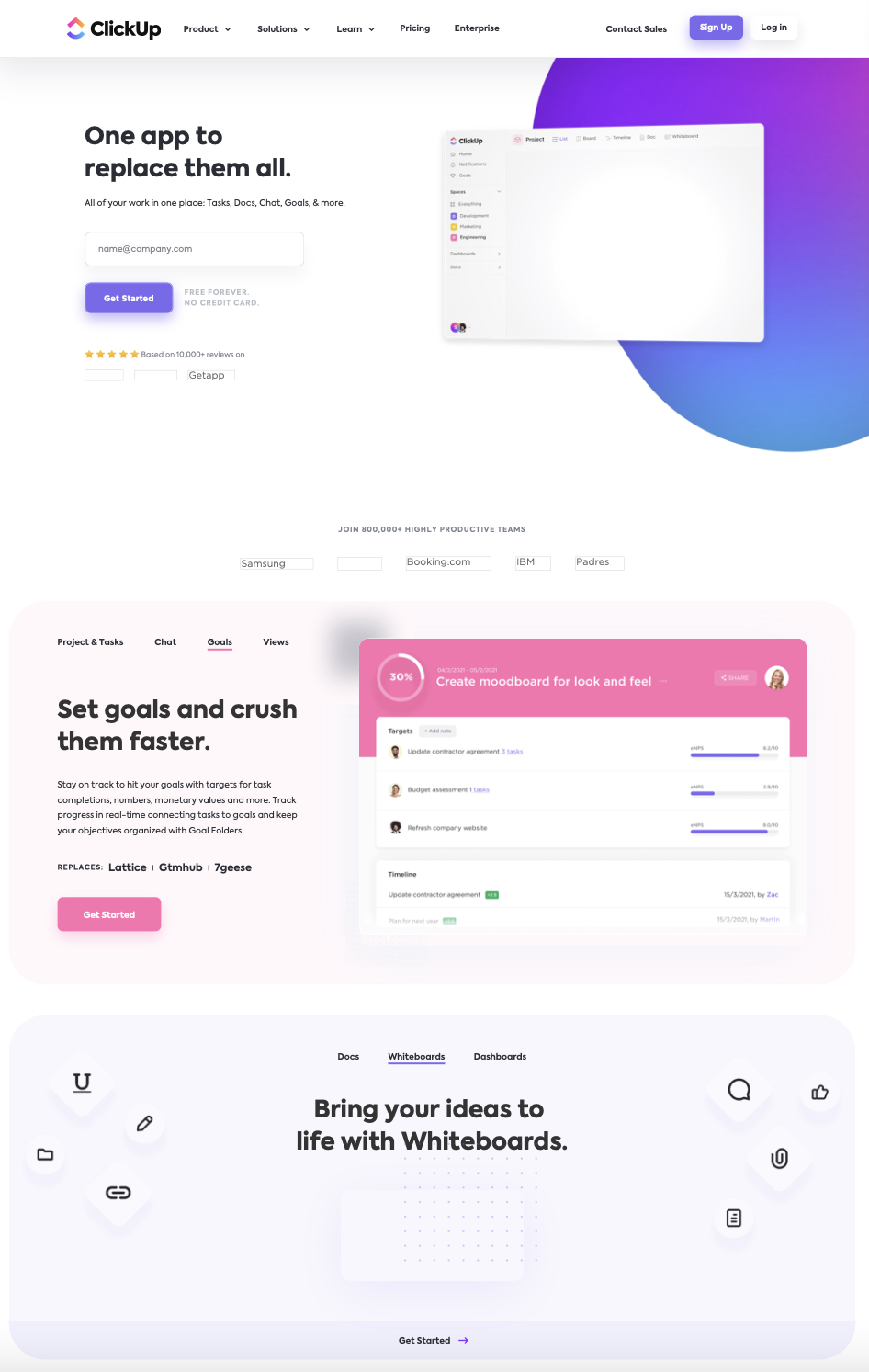
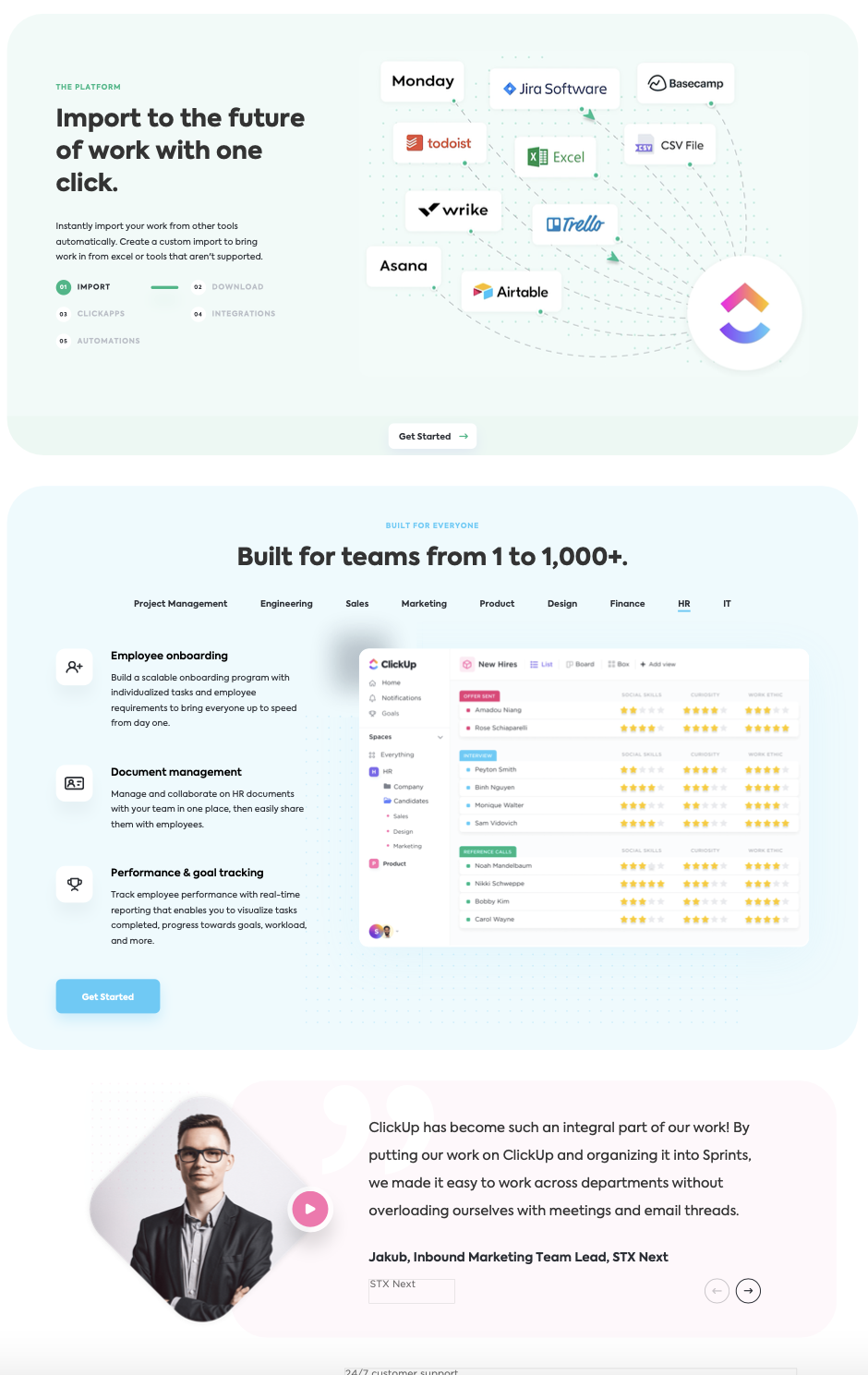
Of all the landing page design examples, ClickUp takes the cake. ClickUp is a project management software that helps teams increase their productivity. It is by no means a “simple” product, but its homepage design should be the North Star for user experience design.
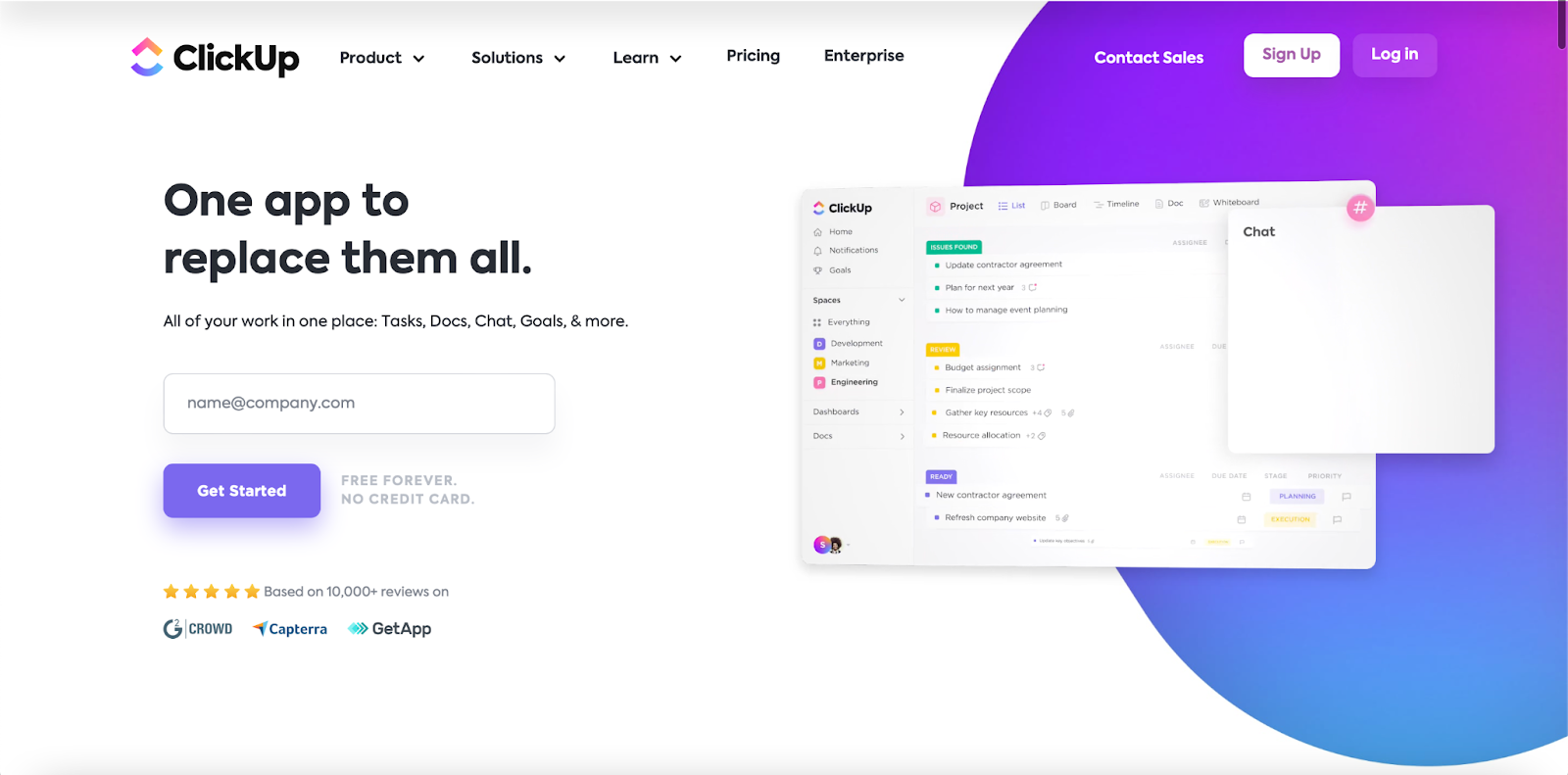
Before scrolling, users see a hero image of the product. Next to it, there is a headline, subheadline, an email box, and a reminder that it’s free forever. The copy is short and to the point, leaving enough space for the graphic design and CTA to shine.
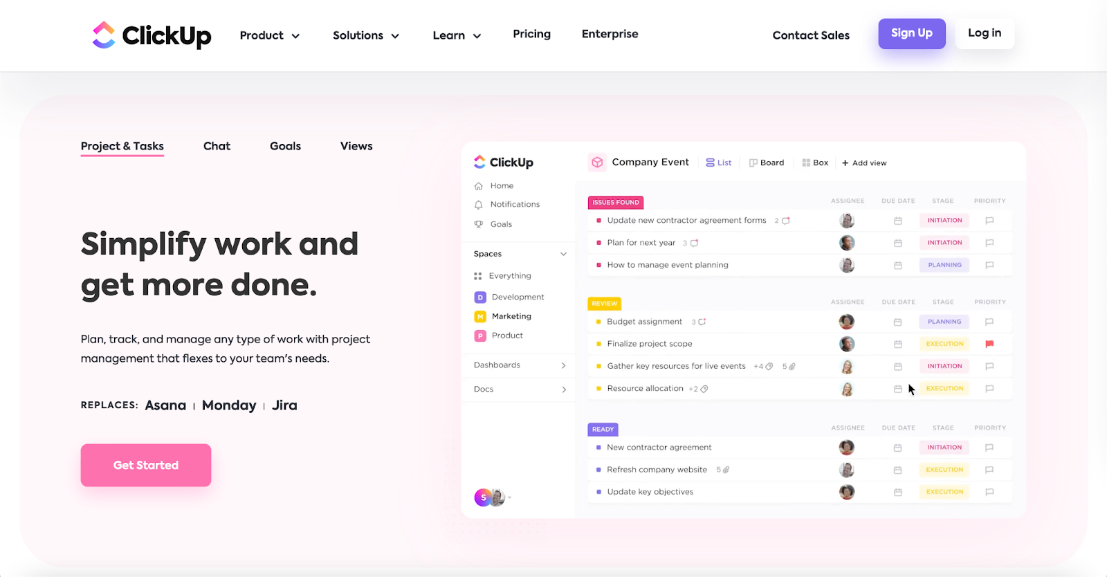
Features are not only highlighted as benefits—they are demonstrated. Rather than use simple graphic design, ClickUp demos its own product. In a world where users have limited time for booking calls and using free trials, transparency on website homepages is key.
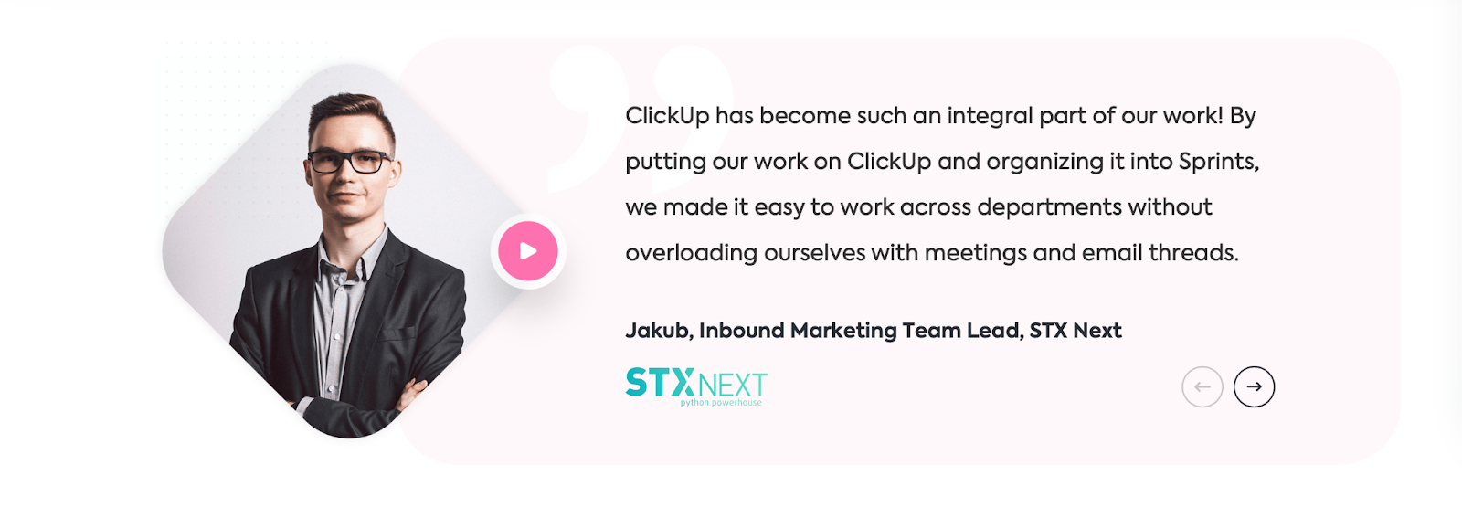
After showing website visitors dozens of its robust features, ClickUp displays a testimonial and logo in an easy-to-scan layout.
Most products and services are less complex than ClickUp, but the company’s website layout, visual hierarchy, ample white space, and helpful animations are things that all designers should aspire to. And with these fundamentals, designers can easily scale up or down.
What ClickUp teaches us:
Cut to the chase. You have about eight seconds to catch and retain your visitor’s attention. ClickUp knows this, which is why they include everything their audience needs at the top of the website landing page.
Show your product in action. Simple animations and design are visually appealing, but they aren’t strong backing for your CTA.
Make use of whitespace. Too much clutter overwhelms users and makes it difficult for them to find what they’re looking for.
Organize your design hierarchy according to features. That way, users can easily find the information they need.
The Basics of Landing Page Design
Now that we’ve gone through some landing page examples, let’s review some of the website design basics:
- Appealing aesthetics: The layout, color scheme, and web design should invoke positive emotions in your visitors. To accomplish this, choose a simple font and colors that are easy on the eyes. Avoid patterns, busy backgrounds, and anything that looks visually “noisy.”
- Less is more: In the UX design process, every element matters. Avoid excessive links, form fields, or images. The goal is to make the user experience as smooth and frictionless as possible.
- Guide users with exit-intent: Apply clickable assets and design elements to guide users through the conversion process. For example, you could use a progress bar to show users how many steps until they complete their purchase.
- Move users cross-device: If users start their journey on one device, make it easy for them to continue on another. Adding social buttons to connect on social media or QR codes to download a mobile app are perfect examples.
- Visual hierarchy: For web designers, the most important design elements should be above the fold. Users should be able to see them without scrolling.
- Call-to-action: Regardless of your conversion goal, all web design needs a strong call-to-action. Get creative with it and avoid the generic “Submit” button.
- A/B testing: Always test different versions of your landing page using a platform like Hotjar. Try different headlines, images, call-to-actions, and layouts to see what gets the best results.
Using these landing page design tips, you’ll be able to optimize your visual design to create the perfect landing page.
Learn to Design Eye-Catching Landing Pages With Skillcrush
The landing page examples we’ve shown you all adhere to the same design basics. But designing a user-friendly website landing page is a tough skill. And building a UX design portfolio with beautiful examples of your work is even harder.
That’s why we’ve created a UX Design Course that will teach you the web design basics—including tips, tricks, and examples. With this material, you’ll learn about everything from color schemes and typography to UX design thinking and methodologies.
Plus, you’ll get access to a community of other designers who are on the same journey as you.

Is Tech Right For you? Take Our 3-Minute Quiz!
You Will Learn:
☑️ If a career in tech is right for you
☑️ What tech careers fit your strengths
☑️ What skills you need to reach your goals